
ProjectHortons
What we didBrand Identity | Design | Photography | Videography
600% revenue increase post rebrand
We loved working with Hortons Estate Agents on the rebrand of their business. When they first approached us, they shared their desire for a bold new visual identity, one that would reflect their ambition to grow into a nationwide brand.
Since launching the new brand, Hortons have not only stood out in a competitive market as the go-to agents, but they’ve also exceeded their nationwide growth ambitions. The rebrand has contributed to a significant increase in both sales and listings.


VIDEOGRAPHYLots of the early stage work that we did with Hortons was to create a solid Art Direction and style for all of their Videography. Highlighting the beauty in the properties they showcase and giving a feeling of a home instead of just a house.
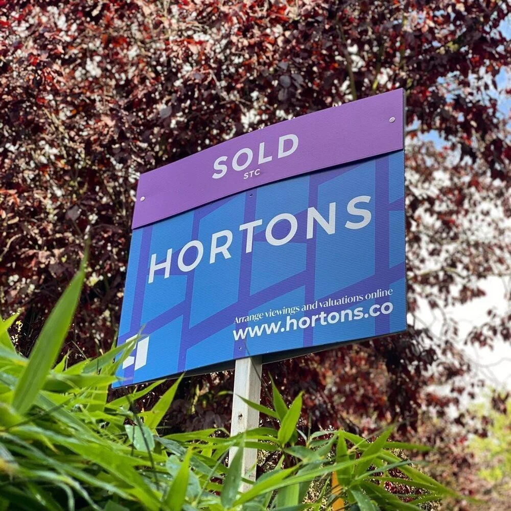
Branding | LOGO DESIGNAs part of the refresh the logo was a big part of the missing piece for Hortons. They wanted a simple, recognisable and effective mark that could sum up the brand in a powerful way.


We launched our business with hopes of growing nationally, and after gaining some initial early traction we decided to rebrand and create an image that supported our aspirations. The guys instinctively understood what we were striving for. We know for certain that Matthews + Cook has helped set us apart, stand out amongst a crowded market and crucially it gave us a foundation for us to build upon.
Adam Horton - Founder at Hortons

Want something similar?